I recently read Roel van der Ven post on showing a graph of myclimatefuture. He shares his results based on where he lives.
These are my results based on living in North America.
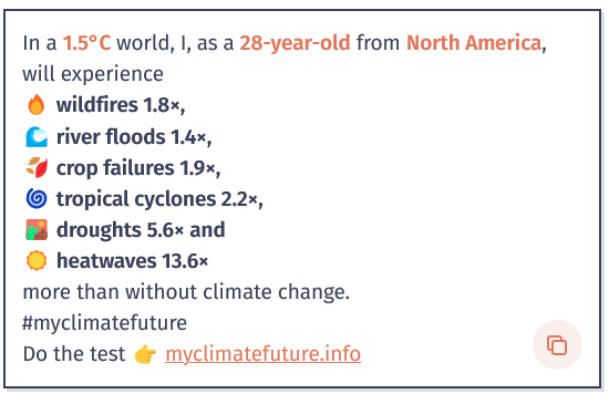
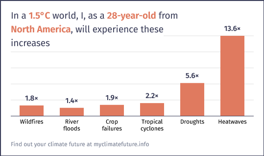
I recently read Roel van der Ven post on showing a graph of myclimatefuture. He shares his results based on where he lives.


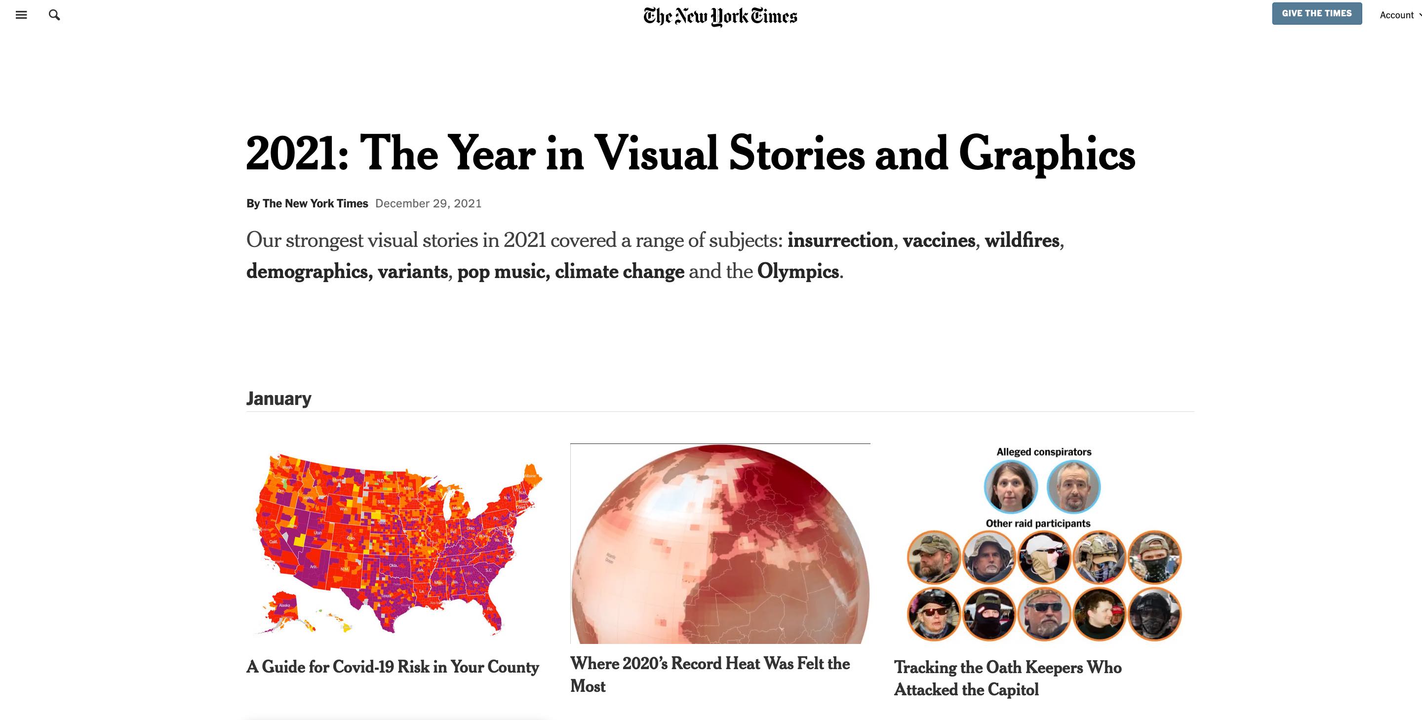 Screenshot of 2021: The Year in Visual Stories and Graphics | Copyright The New York Times
Many people who know me personally, know that I love the New York Times. I'll get straight to the point... I love their Interactives. New York Times (NY Times) interactive articles allow me to visualize and get a deeper understanding of what is trying to be conveyed. Some interactives are very simple to very complex in nature. The interactive visuals are amazing.
Since I am really into photography, I really appreciate the the beautiful photography across the New York Times but the interactives take the cake! I will literally drool hours upon hours just reading and browsing the beautiful photography. The videography was amazing as well. I used some videos from the interactives as examples or inspiration. on how to become better at using the camera, and make better content, overall.
The New York Times is great at their web development. It really has helped me become better at designing on the web and becoming more visual. I am no where near any good web designer/web developer.
My first interactive, which I don't think they called interactive at the time, was Snow Fall back in 2012.
The categories of Interactives that I enjoy are (in no particular order):
Here is my top 5 6 New York Times Interactives. If you need access to an article, I can help you out. Just send me an email at hello@lifeofpablo.com.